Want to refresh your company’s case study game, but not sure where to start? This article is here to help!
We’re holding a magnifying glass up to three leading enterprise companies. You can use some of their ideas and our recommendations to optimize your own programs.
So grab your wetsuit and join us on a deep dive into the B2B case study examples of 3 hugely familiar SaaS giants—Monday.com, Zoom, and Shopify.
Table of contents
I. Monday.com analysis
Who are Monday.com?
Monday.com is a web and mobile work management platform, designed to help organizations with operational efficiency by tracking projects and workflows, visualizing data, and improving team collaboration. Founded in February 2012 by Eran Zinman and Roy Mann, this article tells their story. Monday.com’s current value is over $5bn.
Overview page
A case study overview page (you know, the page on your website that lists your case study content) is an important shop window for the stories you want to showcase. Like any shop window, it needs to be attractive to prospective customers—and show clearly that you offer solutions that are relevant to them.
On Monday.com’s website, the location of this all-important shop window isn’t obvious. Visitors need to navigate a ‘Resources’ tab, then find the relevant link among a busy page of content. While the link is highlighted in a colored box, and there is a ‘Customer stories’ header (albeit in a tiny font), it’s not exactly shouting from the rooftops…
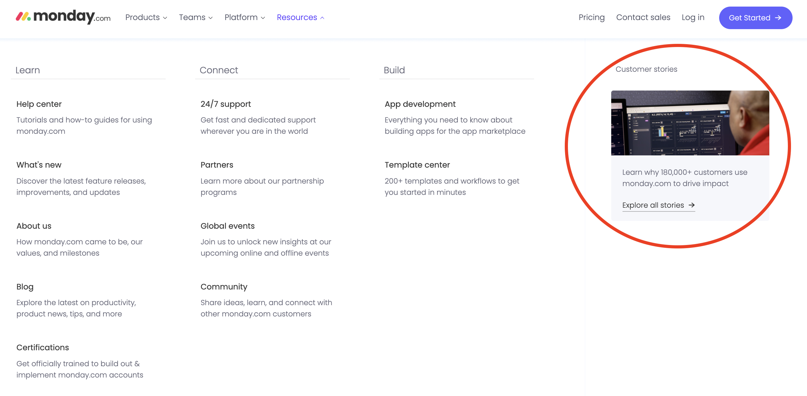
There is an image, but it doesn’t imply ‘customer stories’ to me. It shows the back of a customer’s head in front of the Monday.com platform. The image makes the software the hero, rather than the customer. A smiling portrait of a happy client would arguably encourage more clickthroughs to the overview page.
Once prospective customers locate Monday.com’s case study overview page, they see a confident headline, a metric-driven subhead, and a CTA. Before they reach a list of links to their written stories, there’s a three-minute video case study to watch.
It’s an excellent example of video content. Multiple customers explain how Monday.com has transformed their businesses for the better, highlighting powerful metrics including ‘1,850 hrs of staff time saved’ and ‘$50k a month saved.’
Below the embedded video is a list of all the case studies available to read or watch.
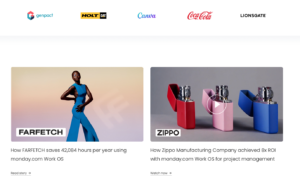
The quality of the photography is standout. Monday.com uses high-quality brand imagery, instead of customer thumbnails or headshots, which makes their overview page feel colorful, attractive, and high-end.
Less attractive is the fact Monday.com doesn’t utilize any of the common tools that help prospects find relevant studies.
There’s no search option, no filters, no subject tags.
The only visual and descriptive clues Monday.com uses are brand logos (not shown in the above image, but seen on most story links) and a headline. While some of the imagery does illustrate the ‘essence’ of the brand—and makes their industry clear—it’s not easy for busy prospects to separate relevant stories from the rest.
How do they foster trust in their case studies?
Trust indicators, such as customer quotes, logos, and headshots are important for adding authenticity to case studies. Used well, they can help to nudge prospects through the sales funnel.
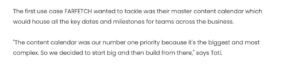
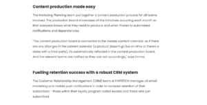
Monday.com uses some trust indicators well. Customer success stories are laden with direct quotes from customers, like this one for FARFETCH.
While Monday.com clearly understands how important direct quotes are for building trust, they only use one ‘hero’ quote in each story—and you have to wait until the end to see it.
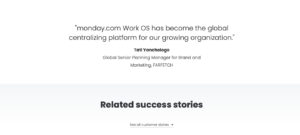
The business could build greater trust by making the hero quote prominent at the start and increasing the number of pull quotes throughout each study.
Remember that prospective customers usually want to hear other customers’ opinions of you in their own words. So be sure to gather up that verbal evidence during the interview stage, and encourage your design team to give customer quotes the star treatment.
Monday.com could demonstrate further trustworthiness by incorporating customer headshots in their studies (hey, they’re real people!) and including customer logos on all of the case study pages.
Are they scannable and easy to digest?
Some SaaS and B2B brands hesitate to include long-form content on their websites, worrying that prospects won’t absorb lots of words online.
Luckily, by following a few simple rules, companies can make long-form copy readable and scannable. Layout elements such as crossheads, sidebars, images, and results bars turn vast walls of text into tastier tiles that are easier to read and act on.
Monday.com does a good job of making long case studies palatable. During my analysis, I appreciated the impactful headline and results bar that introduced each study.
Using a bright color to highlight a key metric, for example, is a great way to draw scanning eyes toward a key aspect of the study.
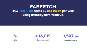
The results bar (above) shows prospects—in a short and sweet way—the impact Monday.com had on this customer. Kudos for that—and for achieving such impactful numbers!
After a couple of intro paragraphs describing the customer, Monday.com includes another scannable bar of information…

It’s informative, but it comes too late. The information included here is what prospects want to know before they decide if a success story warrants their time.
With a search function and filtering options on their overview page, prospects would have been able to find the stories most relevant to their industry and use case, without having to scan individual stories.
Within the main body of content, different sections are headlined Challenge and Solution, which aids readability.
Within those sections, Monday.com uses crossheads that concisely summarize specific outcomes and achievements. As a prospective customer short on reading time, you can easily find the most relevant needles in the haystack…
One surprising omission for me—but which Monday.com may well have a strategic reason for—is the lack of a Results section.
Every prospect wants to know the results and outcomes they can expect to see if they roll out your solution. While Monday.com includes metrics in the top bar, they don’t always expand on them in the main study.
As a reader, if I see a topline metric that a product saved thousands of human resource hours, I want some detail on the specifics behind that figure. It needs to feel relatable and recognizable, so I can imagine the same impact on my business.
Ranking their writing
Monday.com follows the tried and trusted case study structure of presenting a customer’s challenge and pain points—then showing how Monday.com helped to solve them.
From the handful of success stories I reviewed, I felt that Monday.com could have plunged readers into the story faster. In some cases, it took several paragraphs to reach a clear pain point that prospects could empathize and connect with.
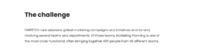
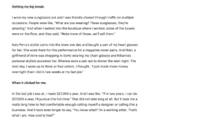
In the FARFETCH example, the writer uses a lot of words to explain complex interactions between members of their marketing planning team…
FARFETCH runs extensive global marketing campaigns and initiatives end-to-end, involving several teams and departments. Of those teams, Marketing Planning is one of the most cross-functional, often bringing together 400 people from 40 different teams.
The planning team leads key brand and marketing activations, including brand partnerships, customer experiences, and trade and promo activities. These activations require support from every brand and marketing team, from retention and acquisition channels to product and analytics teams and every team in between.
This could be way more impactful as a punchy single paragraph, such as…
Delivering global brand and marketing campaigns is hugely complex for FarFetch’s planning team. Sometimes 400 people from 40 different teams all need to be on the same page.
Less preamble and straight into the juicy stuff!
As their SaaS case studies unfold, Monday.com does a good job detailing the specific ways their solution helps customers. But having read Gong’s studies recently, I feel Monday.com could inject more energy and storytelling into their studies. While their brand book describes their style as snappy, direct, and conversational, I found their case studies overly formal—and not as welcoming or invigorating as the website’s design.
I’d also like to learn more about the characters in their success stories—their emotions and motivations—so we can empathize with their challenges a little more.
And, as I mentioned in the previous section, without a detailed Results section, the reader doesn’t feel the full scale of the business transformation that has occurred.
Recommendations
Monday.com could enhance their customer case study program by:
- Including a search option, sector and use case filters, and filter tags on their overview page
- Making their customer success stories more prominent with a specific ‘Customers’ tab in the main menu
- Including more trust indicators in their studies, including customer headshots and logos
- Creating more empathy for the customers who are quoted by digging into their emotions and motivations a little more
- Including a detailed results section in the main body of each study, so readers understand the full scale of business transformation
II. Zoom analysis
Who are Zoom?
Zoom is a communications technology company headquartered in San Jose, California. Founded in 2011 by Eric Yuan, Zoom’s communications platform allows users across the world to virtually meet with others via video, audio, phone, and chat. This article in Forbes tells the founder’s story. Zoom is currently valued at over $21bn.
Overview page
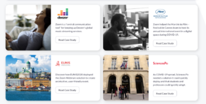
Zoom falls into a similar trap to Monday.com, by hiding their case study overview page behind thick curtains.
Reaching customer success stories requires website visitors to click through the Resources tab, then search out the Explore header, before finding Customer Stories among a sea of blue links. Where Monday.com at least highlights the link to their case studies in a colored text box, complete with an image, Zoom hides them away.
When prospective customers do arrive at the overview page, there’s a lot to like.
Zoom includes a search function and three different filter options, so prospective customers can hone in on the most pertinent stories.
Filters are available for ‘Products’, ‘Industries,’ and ‘Countries.’ From research we’ve done at Case Study Buddy, industry and product/service are the most popular filters used by the world’s top 50 SaaS businesses. By including a countries filter, too, Zoom shows their brand has global reach.
Zoom also uses a large company logo on each story link, which acts as another cue to help prospects find suitable studies faster…
While many case study overview pages use metric-focused headlines to tease the story, Zoom provides a short synopsis instead. There’s not much consistency here, with some teasers highlighting a challenge that the customer faced and others simply stating the use case.
While Zoom includes images on their overview page, they don’t provide strong visual cues as to what the customer actually does. Using imagery to show each brand’s ‘essence’ more explicitly would help to communicate relevancy.
How do they foster trust in their case studies?
Zoom uses several elements to show their case studies are authentic.
In this example with customer Deezer, Zoom includes a large customer quote and prominent customer logo. As you get into the weeds of the study, they let the customer tell their own story through copious direct quotes.
While the pull quote they use successfully communicates trust and authority, it lacks a customer headshot, which would add even more credibility….
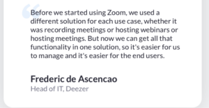
As professional case study creators, we know that headshots can be difficult to lock down. Customers are often too busy to send anything or don’t want to take all the credit. But it’s worth being persistent. Headshots are essential as a trust indicator and make every study more relatable because your customer’s not just a faceless voice.
Are they scannable and easy to digest?
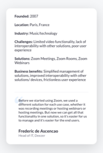
The B2B case study examples on Zoom’s website use design and layout elements to improve readability.
A clean and clear sidebar rounds up key facts about the customer and what they achieved with Zoom. Sidebars improve readability by shrinking the column width of the study itself. Shorter column widths are generally preferable, as busy readers can be put off by long lines of text.
One aspect that is missing from the sidebar is a CTA. Sidebars are one of the most prominent parts of a case study, so it makes sense to include a CTA where the most eyes are.
Zoom also prevents reader fatigue by keeping their studies relatively short—around 700 words—and using large crossheads to break up blocks of text.
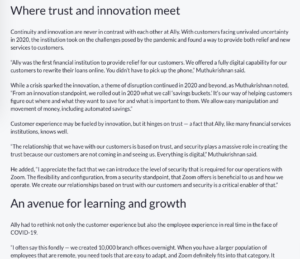
Despite the crossheads and short paragraphs, their studies still feel text heavy. To really nail it on readability, Zoom could think about adding more pull quotes and images. Even implementing a quick fix, such as bolding up powerful quotes and sections of the narrative, could help.
Ranking their writing
Zoom’s B2B case study examples are written directly and concisely, with few words wasted. They use customer quotes well to build on each story and provide important human context.
This section is a good example…
With offices around the world, the teams at Deezer needed an effective means of collaborating and communicating digitally. The legacy video conferencing solution Deezer used, however, was short on functionality and heavy on management.
“Our previous solution was a little hard to manage,” said Nicolas Le Corno, Corporate Tools Administrator for Deezer. “Many of the people in the company are using Linux, and our legacy solution wasn’t available on Linux platforms, so we needed to find a solution that could work for them.”
The line “short on functionality and heavy on management” says a lot in 7 words. They could probably take their casual and conversational style even further, so easily distracted readers don’t lose interest. This could work…
With offices around the world, Deezer’s dispersed teams needed a no-fuss way to collaborate and communicate digitally. But their video conferencing software was short on functionality—and heavy on management.
In the studies that I reviewed, Zoom provided a general taste of the experience using their solution—seamless collaboration for remote teams/binding workforces together—but I felt they were a little vague and nonspecific.
I’d like to see more metrics around cost and time savings, or additional revenue that customers have generated off the back of closer teamwork. Zoom would also do well to be clearer about what improved collaboration actually means in terms of real business outcomes. Are customers more satisfied, are they making more money, and does greater productivity mean more innovation and growth? Tell me more!
The absence of hard numbers doesn’t mean you can’t tell a good success story. But compelling results will enhance an already great story, turn heads and inspire clicks.
Recommendations
- Improve signposting to the overview page, which is currently hard to locate
- Improve visual cues on the overview page, particularly selecting images that show what each customer does
- Add further trust and credibility with customer headshots
- Include a CTA in the study sidebar, the most eye-catching component of the study
- Break up text-heavy sections with more images and/or pull quotes to improve scannability and readability
- Drill into specific results that Zoom achieves for customers’ businesses, beyond general commentary around ‘seamless collaboration for remote teams’
III. Shopify analysis
Who are Shopify?
Shopify is a user-friendly e-commerce platform that helps small businesses build an online store and sell through one streamlined dashboard. Shopify is headquartered in Ottawa, Canada, and was founded by Tobias Lütke and Scott Lake in 2006. This Forbes article tells their story. The business is currently valued at over $57bn.
Overview page
Shopify does things differently when it comes to showcasing customer success. They frame customer success stories in a unique way—as ‘Founder Stories.’
Shopify’s customers are small businesses who use their platform to grow online. So they present them as ‘entrepreneurs’ in their case studies, using their stories to inspire other budding business owners to be the same—using Shopify of course!
Like the other SaaS businesses analyzed in this article, Shopify puts a virtual invisibility cloak on these stories, hiding them behind too many layers. Prospective ‘founders’ need to go to the Resources tab and then locate Founder Stories in a section called ‘popular topics.’
But when they find the overview page, they find something VERY special…
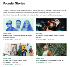
The intro copy for the overview page really stands out. It’s creative, emotion-packed, and vibrant.
“These are the stories of the brave and the bold, the planners and the risk-takers, the dreamers and the doers. In conversations with the diverse Shopify founder community, we uncover the secret ingredients of success. Be inspired to take action by those who have paved the way before you.”
Love it! It makes you excited to be part of a brand with such a bold identity.
The page does include a search function (yay!), but filters are limited to ‘popular’ and ‘latest’ meaning it may not be all that easy to sieve out irrelevant content.
There’s every chance this is done by design, rather than accident. You get the impression straight away from the customer/founder-centric imagery and generalized but intriguing headlines that every story is worth your time, whatever area of e-commerce you want to succeed in.
Shopify includes a headline on each story link. However, unlike other examples we’ve looked at—where the B2B business in question highlights the business results they’ve achieved for the customer—Shopify focuses on human interest aspects of the stories, tapping into our natural curiosity for the lives of other people. Bold, customer-centric images build connections with readers.
How do they foster trust in their case studies?
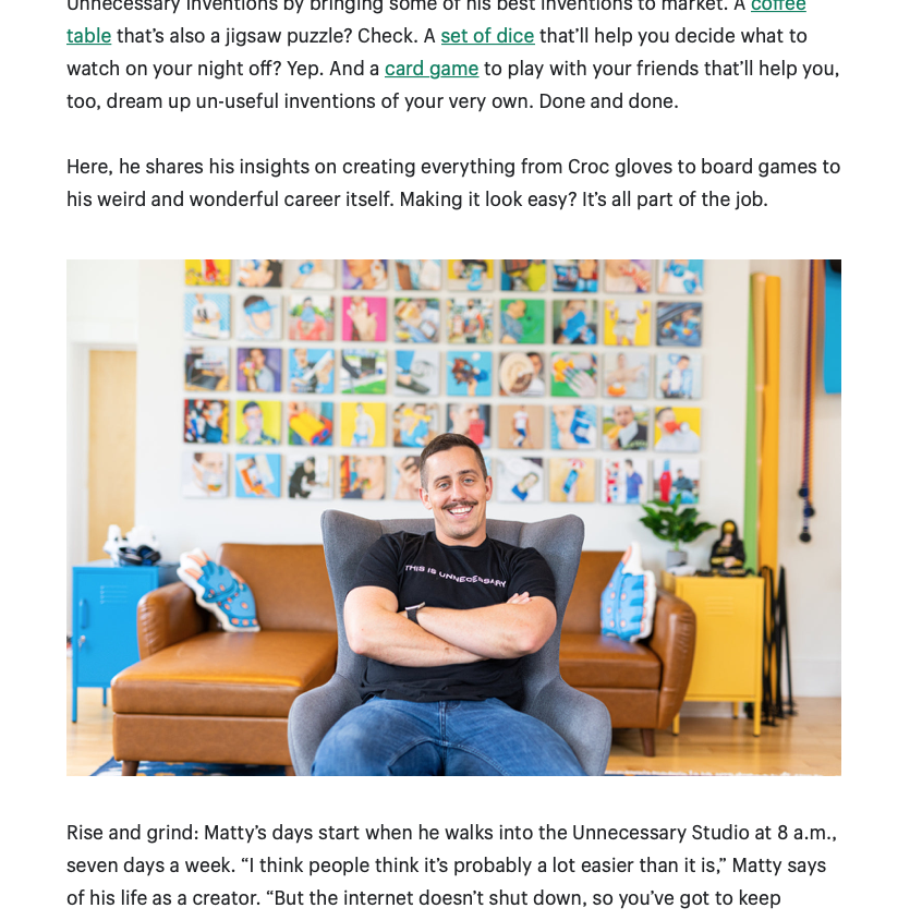
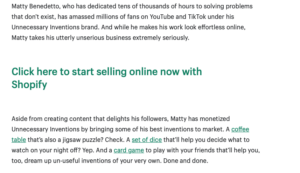
Trust indicators are everywhere in Shopify’s B2B case study examples. Unlike other SaaS firms we’ve analyzed, Shopify has no problem sourcing images of their customers—and they don’t stop at headshots! Every article includes a variety of professionally shot images of the customer, with a creative design treatment that often shows their businesses in action.
Like this founder munching noodles…

Let’s remember that case studies are people stories. When we see a happy customer in the flesh—like in the previous eye-catching image—we’re more likely to see ourselves in them, relate to them, and trust that the story Shopify is sharing is authentic.
Shopify’s Founder Stories liberally use customer quotes as trust indicators. They’re dotted through stories and pulled out as exploded quotes, acting as high-impact trust bombs that bring their case studies to life.
Are they scannable and easy to digest?
Shopify gets another huge tick for how reader-friendly and scannable their Founder Stories are. This is important because a few of the studies that I reviewed hovered at around 1,500 words. That’s a mighty, meaty article, that could be difficult for readers to absorb without a few UX tricks.
For example, I like the way they tell us how long it will take to read the full article at the start (an 8-minute read)…
By repositioning the article as an ‘8-minute read’, it feels achievable and coffee-break sized.

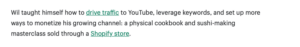
Shopify improves scannability by breaking up long runs of copy with bright images, screengrabs from customers’ social channels, pull quotes, and crossheads.
In most cases, they run just one or two paragraphs of text before dropping in one of these elements.
I appreciate I’m a small sample (one man sitting at home in his office – hello out there!), but the scannability of Shopify’s studies definitely increased my average time on page compared to other companies I’ve analyzed.
To different degrees, Shopify uses other techniques to make content digestible. Some, but not all studies, include a fact file about the entrepreneur.

Again, this improves scannability. They add a lighter touch, too, sharing that the founder is a Resident Evil genius. Fun facts like this make the hero of our story more relatable, and we’re probably more likely to see them as someone just like us.
Additionally, Shopify regularly uses CTAs to break up wordy sections into digestible chunks. This potentially drives readers to take action while they’re fully immersed in founders’ motivational stories…
Ranking their writing
Shopify’s approach to customer success stories takes a different lane from many SaaS brands. They don’t follow the path of sharing how customers needed an e-commerce platform to scale their business, how Shopify came to the rescue, and what results they achieved.
Instead, Shopify’s case studies feature the broader journey of their founders: their origin stories, how they built their businesses—and in some cases empires—and offer practical advice on growth and understanding your audience.
Usually, they include just the tiniest mention of Shopify, and sometimes not at all. In this story, for example, this is the only reference to Shopify in 1,500 words.
It takes a confident brand to only mention their business once in 1,500 words of marketing copy.
The strategy here is interesting. I’m just making a guess here (and could be ‘wronger’ than a flat earther), but it seems like Shopify is focused on demand generation as opposed to lead generation here.
They’re using exciting, inspiring, and educational content to build excitement and awareness about their brand, which should ultimately result in high-quality leads.
Shopify’s writing is genuinely excellent. Articles read like a down-to-earth, friendlier version of Forbes. I mean, how good is this as an intro…?
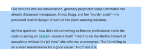
We learn about our principal character (and customer), we get caught up in the intrigue of her story, and we’re teased with the promise that we might learn how to crack selling on TikTok. I write a lot, and I read a lot, and this—like most of Shopify’s Founder Stories—is dynamite.
Shopify uses variety to add spice to its case studies. While maintaining a regular structure can help prospects easily scan and find the information they need, Shopify prefers to mix things up.
Alongside the long-form pieces I’ve discussed, they run success stories as Q&As, numbered lists, and other funky formats. Like this one…
Done well, mixing up formats like this can be a good way to keep readers engaged and your content fresh. Alternatively, you can create a consistent and familiar main format, and then spin off different versions to meet different needs across your funnels. Think one-sheet teasers, Q&A blog posts, audiograms, and more.
Recommendations
- Make it easier for website visitors to find their amazing Founder Stories, instead of hiding them inside a very general ‘Popular Topics’ tab
And that’s it for my recommendations!
Shopify knocks it out of the park with trust indicators galore, brilliant scannability, and unmissable writing.
IV. Conclusion
The three leading SaaS companies analyzed in this article are all doing a good job of creating effective case studies at scale and integrating them fairly well on their websites.
However, these powerful assets are difficult to find, wrapped up under layers of links and sometimes hidden in random locations. All three businesses could and should make them easier for prospective customers to locate.
Across the three companies’ case study programs, there’s so much that any business can learn. Hopefully, by reading this article, you’ll have a better grasp on how to optimize all the benchmarks we’ve covered and build more of these high-octane assets in your own business.
If you need any help at all planning and creating case studies, we’re here to help.