What’s the ideal case study length?
If your case study is too long… your leads might not look at it, never mind read or watch it.
But if a case study is too short… it may lack the details it needs to persuade leads that you’re the one and best choice for them.
So how long should your case study be?
Fortunately, research gives us some guidelines for case study length on the written side of things.
According to a DocSend report of 34 million content interactions, for example, case studies should be two to five pages in length.
They advise:
“Try to get [your text] into a piece of sales content just 2-5 pages in length, total. Based on our analysis, completion rate for case studies of that length was highest across all content types….”
Did you catch that last bit? Case studies in that range have the highest completion rate over ANY content type shared with DocSend—blog posts, brochures, whitepapers… the works!
Still, two to five pages is a *very* broad range. And what does a ‘page’ mean? Does that mean your case study should be 600 words? 1,200? 2,000? Does word count even matter?
Unfortunately, the only answer to this question is: it depends! Different lengths can play better or worse in different scenarios.
Let’s unpack what that looks like, practically—and how you can arrive at the right decision on length for your use case.
Your case study must be long enough to tell the story
One factor to consider when deciding on the “right” length for your case study is the story you want to tell.
As any campfire enthusiast will tell you, some great stories are long; others are short.
For example, we recently completed a case study for a client that came in at a whopping 1,838 words.
Why so long?
Quite simply, the story was complex, and the writer needed all 1,838 words to tell it.
This high-profile project involved six different creative teams, each playing a different role—all of whom needed to be spotlighted.
The project also garnered a lot of media attention and some jaw-dropping results, which we also wanted to hit on.
In short, everything in that case study needed to be there.
In contrast, the same writer wrote a case study for a different project that clocked in at a brisk 650 words. Here, the story was simpler—with fewer actors and a more straightforward solution—and 650 words was more than enough.
In summary, your case studies should be as long as they need to be to tell the story.
Which isn’t a terribly helpful guideline, I know.
So let’s look at a couple other factors you should consider when deciding on length.
Align case study length with your target audience
You can look at case studies through two different (although related) lenses: 1) whom you’re targeting and 2) how you’ll use them.
Let’s look at targeting first.
We can agree that executive decision makers want different things from your case studies than product or service implementers.
Executive decision makers aren’t particularly interested in the nitty gritty details of your projects. They want the highlights and the results.
After all, they’re not the ones who will be implementing and managing the solution. Generally speaking, they just want to know that the product or solution will succeed. And besides, they simply don’t have time to wade into all the details.
So a shorter case study, with descriptive titles and bullet points, gives this target audience what it wants.
In contrast, implementers—or those making buy/don’t buy recommendations to the executive team—ARE interested in the details. They’re going to be the ones implementing the product or solution so they want to know everything about the strategy, steps, delivery and more.
They want a blow-by-blow account of what happened. What went well? What went wrong? How did you adapt? What was the thinking behind your decisions? What were you like to work with?
These details come forward in the solution section of a case study—so that’s where you’ll see the greatest variance in case study length.
Align case study length with your sales funnel
Another factor to consider is how you will use your case studies.
Will you use them at the top, middle or bottom of your sales/marketing funnel?
Case studies aimed at top-of-funnel leads can often be shorter. You want something that leads can absorb and scan quickly. After all, your goal at this juncture is to raise awareness of your service or product.
At this stage, leads are still researching and considering their options. Giving them all the details will be fruitless and may even confuse them.
Similarly, if you’re doing cold outreach, a short case study often makes more sense than a long one.
However, there are some exceptions. In the case of an ad campaign, for example, a longer case study might be the way to go—even though you’re marketing to top-of-funnel leads.
Why? Because ad campaigns are often targeted at specific pain points or “how to” type processes, and you’ll need a longer case study to delve into how your product or service solved that pain point.
Continuing with the same logic, case studies aimed at the middle or bottom of the sales/marketing funnel can usually be longer and more detailed.
At this later stage, leads have narrowed their list of potential vendors and are ready to get into the weeds with you.
Again, you want to give them that longer solution section that walks through each stage of the implementation process.
Here, a five-page case study (or even longer) might be what’s needed to move a lead down your funnel.
Best option: Tell the same story in different formats
So some case studies should be short; others should be long, depending on whom you’re targeting and how you’ll use them.
But what if you want to target different audiences at different stages of your funnel?
In this scenario, your best option is to tell the same story in different formats.
Let me use a food analogy to explain.
Sometimes you’re hungry for an entire meal. Other times, you want a snack.
If you’re uncertain, you may only take a nibble. If you like that nibble, you might try a bite. If that tastes good, you may move on to eat the entire meal.
It’s the same with case studies.
A story can be as short as a testimonial when a pinch of proof is all that’s needed.
But the same story can be told as a full-blown written or video case study when a meal is called for.
These nibbles, bites, snacks and meals can also work together.
A short 15-second video might gain attention for a larger piece that tells the full story and gets into the “how” of a project.
A two-sentence teaser in a newsletter might cause a lead to click through to your longer case study to get all the details.
Telling the same study in all these multiple formats might sound like a slog—but, it’s not at all.
Most of the work in creating a case study is in devising strategy, getting buy in, performing research and conducting great interviews.
Once you’ve navigated these challenges, telling the story in multiple ways is easier.
You don’t have to start with the longest asset (although that’s what we usually recommend).
Once you have it, creating other, shorter versions is much easier than starting from scratch.
(That’s why we offer a discount for case study packages that include different formats of the same customer success story.)
Example: Loganix
To better understand these formats, let’s look at one customer success story we told six different ways:
- Narrative case study
- Snapshot case study
- Slide deck
- HTML teaser
- Audiogram
- Image cards
This is the story of Loganix and its customer Rankings.io.
Loganix provides citation building and local search marketing solutions to agencies and publishers around the world.
Its customer, Rankings.io, helps elite personal injury firms dominate first page Google rankings.
In this customer success story, Loganix helped Rankings.io get seven times more keywords on the first page of Google through its citation building services.
Narrative case study
Let’s start with the narrative case study for this success story.
Here’s the cover page:

As you might expect, this detailed case study describes the challenges, solutions and results.
But the bulk of the case study is in the solutions section, where we really dig into the details of why and how Loganix was able to help Rankings.io obtain such great results.
This section details key differentiators that made all the difference for this project, such as Loganix’s strong relationships with publishers and its hands-on approach.
Here’s a page from the solutions section of the case study. I’ve circled two of those important differentiators: 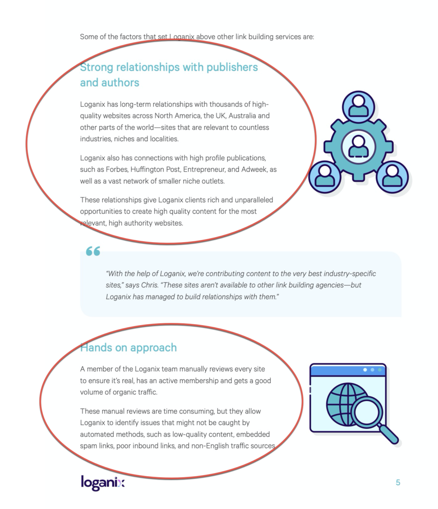
Why do we go into so much detail into the WHY and HOW of this customer success story?
Because this case study format is designed for those who will be working closely with Loganix—or those recommending whether to choose Loganix or some other agency. They need these details to help them evaluate whether Loganix is the right choice for them.
Including all these details makes our narrative case studies the equivalent of a meal, for those who are hungry to learn everything.
Snapshot case study
We also created a snapshot case study for this same customer success story.
This format is significantly shorter, hitting the highlights without going into all the details. The solution section in particular is shorter.
To make the point, here’s a page from that section:
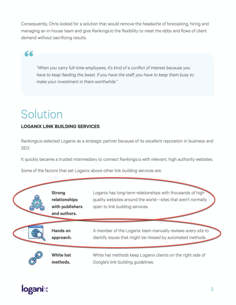
I’ve circled the same points as in the narrative version of this case study, but here they’re abbreviated, as you can see.
By reducing these points to a couple of lines, we’ve made this case study more digestible and scannable. It’s perfect for busy executives who just want the highlights or top-of-funnel leads who are still discovering their options.
If the narrative case study is a full sitdown meal, the snapshot is like a meal you can eat on the run—satisfying but quick.
Slide deck
We also created a slide deck for the same customer success story.
The slide deck tells the same story but hits the highest points only.
After all, the idea isn’t to have leads sit down and read the slides but for the sales team to present them and provide context verbally.
Here’s the slide where we boiled down the challenges that Rankings.io faced to three bullet points:
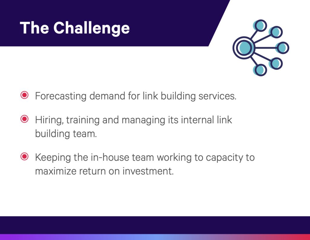
While this slide deck is brief and to the point, it still includes important social proof, such as quotes from the customer:
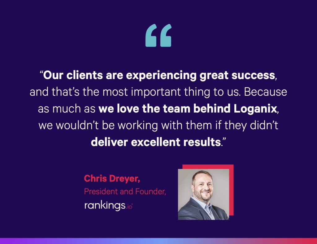
If we return to our food metaphor, the slide deck is equivalent to a snack—it gives leads a few mouthfuls to try.
If they like the taste—and want more—they can move on to the narrative or snapshot versions.
HTML teaser
We created yet another asset for this customer success story: a HTML teaser page.
The HTML teaser is designed for Loganix’s website. It’s short enough for easy online scanning but long enough to communicate essential points.
Here’s the desktop version:
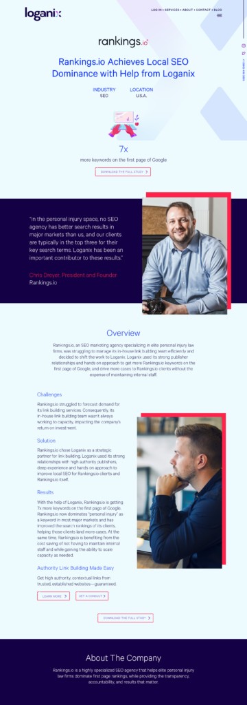
This snackable size is perfect for the web—and can again drive leads to the full story for those who want more details (note the “download the full story” call to action button at the top).
Audiograms
We also had the pleasure of creating some audiograms for Loganix for this story.
These audiograms consist of short audio snippets of Rankings.io’s President and Founder, Chris Dreyer, explaining how amazing Loganix is—in his own words!
These audio clips were taken directly from the interview we conducted for the case study.
Audiograms can generate interest in top-of-funnel leads while driving others to the narrative or snapshot versions for more info.
Image cards
Another way for Loganix to cultivate leads with this success story is to share it on social media and in marketing campaigns.
That’s why we created image cards with testimonials that can be used in any number of ways:

Again, these little “nibbles” can be used to drive leads to longer versions of the customer success story.
Using design elements for greater versatility
We’ve talked about how different formats can be used for different points in your funnel, using Loganix’s customer success story as an example.
But we should also talk about how we use design elements to make these assets more versatile.
Sidebars, visuals, and highlighting help these assets do “double duty,” reaching audiences that they may not be exactly designed to reach.
For example, we include a sidebar of highlights in all our narrative case studies.
Here’s an example, again from Loganix (sidebar highlights circled in red):
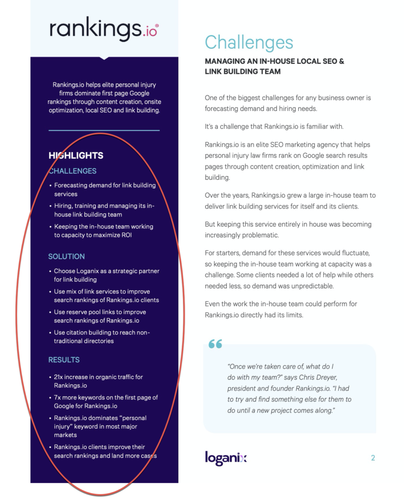
While this narrative case study is long and detailed, this sidebar still makes it easy for busy executives or top-of-funnel leads to get the gist without reading the entire study.
It’s like embedding a snack within a sitdown meal!
This method of using design elements to increase versatility is so effective, we also use it in many of our snapshot case studies.
Here’s an example from Loganix (highlights circled in red):
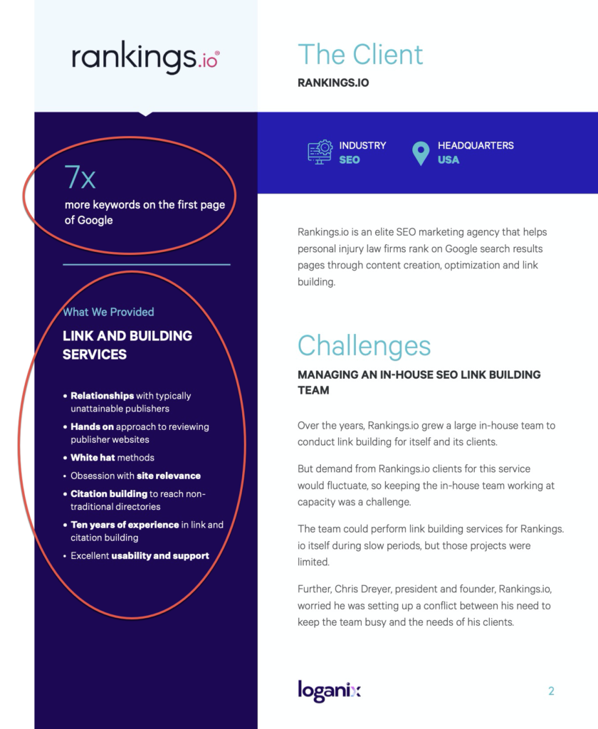
Again, this side bar helps make even this shorter case study more scannable and versatile.
We use these design elements, and others, to make every asset we create more flexible and versatile.
Focus less on length and more on purpose
Unfortunately, there’s no simple answer to the question of how long your case study should be.
You have to think about the story you want to tell, whom you’re targeting and how you will use it.
If you want to get the most mileage from your case studies, best practice is to create a variety of assets to satisfy different appetites, from image cards (“nibbles”) to HTML teasers (“snacks”) to full written studies (“meals”).
At the same time, you can use design elements to make all of these assets more versatile.
So if you’re still asking yourself how long your case study should be, you may be asking the wrong question.
Instead, ask yourself how many ways you can tell the story.
Need help transforming your customer success stories into valuable marketing assets?
Contact us to start the conversation.