We’re all surrounded by marketing content.
It’s everywhere—in our social feeds, email inbox, Google searches, YouTube channels, etc.
Within this deluge of advertising and information, how can you stand out and capture the eyeballs of your target audience?
What will stop them in their tracks and spur them to connect with you?
Often, the solution lies in a subtle marketing concept: the curiosity gap.
What the heck is a curiosity gap?
In marketing, a curiosity gap is a persuasion technique you can use to purposefully spark curiosity in your audience and leverage their internal compulsion to close gaps in their knowledge.
In short, it’s the purposeful omission of a specific, relevant piece of information in a story that piques their interest.
American economist George Loewenstein was the first to describe the concept (which he refers to as “information gaps”).
He noticed that when people realize they’re missing a useful piece of information, they get an irritating sensation that they need to complete the “knowledge picture”.
Use your case study—particularly its headline and cover page—as a way to spark curiosity in your target audience and get them to read on.
The gap makes them curious.
And that curiosity is deeply compelling, like a maddening itch to fill in the blanks.
You can create a curiosity gap anytime by introducing a story that’s rich in detail, but leaving out something essential.
Then you give your target audience a chance to scratch the itch.
Which usually means following through on your call to action, whether that’s to click, download, buy, or subscribe.
How does it work?
To start, let’s look at a couple obvious examples where curiosity gaps are used to motivate people to take action.
The clickbait headline
Clickbait headlines employ curiosity gaps ALL THE TIME.
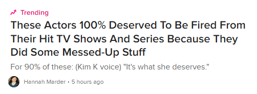
Here’s an example from Buzzfeed:

This headline sets up two curiosity gaps: 1) which actors deserved to get fired and 2) what could they have possibly done to deserve it?
The movie poster
Curiosity gaps are also widely deployed in movie advertising.
Whether it’s in a trailer, online display ad, or print poster, movie advertisers will often try to spark the curiosity of potential moviegoers.
They give the audiences the story setup… but leave them hanging with important questions unanswered.
And they can only answer those questions by buying a ticket for the show.
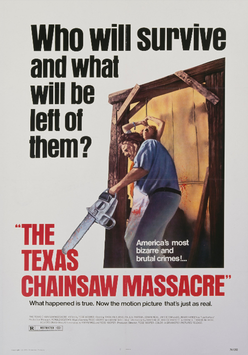
For example, here’s a classic movie poster that sets up horrific curiosity:

Who will survive the Texas Chainsaw Massacre—and what will be left of them?
We don’t know. The poster doesn’t say.
If we want to find out, we’ll have to watch the thing. (Spoiler alert: it doesn’t end well.)
Using Case Studies to Spark Curiosity
We’re not suggesting that you start writing cheesy clickbait headings or designing scary movie posters for your product or service.
What we ARE suggesting is that you use your case study—particularly its headline and cover page—as a way to spark curiosity in your target audience and get them to read on.
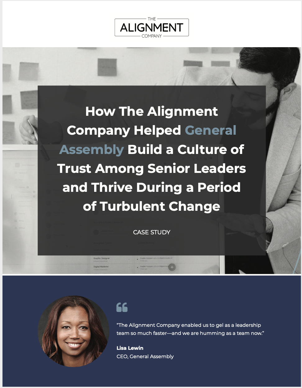
Here’s an example from The Alignment Company, one of our clients:

Notice how this cover page sets the scene:
- We get a sense of the customer and pain point (i.e. a company where the leadership team wasn’t gelling)
- We understand the win they achieved (i.e. “built a culture of trust among senior leaders,” and, “thrived during a period of change.”)
That’s all great info.
So where’s the curiosity gap?
The piece that’s missing is how they did it.
The target audience for this case study—companies suffering with the same pain point—will want to know HOW The Alignment Company helped its client reach that goal.
They want to learn how to recreate that win in their own business.
And they’ll be motivated to dive into your case study to fill that irritating gap in their knowledge.
How to write an irresistible, curiosity-provoking headline
You can leverage your readers’ “fill the gap” reflex by crafting your case study headlines and cover pages with magnetizing details—and a strategic omission.
Here’s how to do it:
- Start with the WHO of your story: Help your target audience relate to your story by naming the customer, if possible. If you can’t use the brand name (i.e. if your client requested an anonymous case study), label their industry or niche instead. Design details can also help indicate the type of customer involved.
- Include the pain point: Another important signal of relatability is the pain point you helped solve. The closer the pain point is to the reader’s experience, the more sharply they’ll feel the tension between their present struggle and your customer’s triumphant win.
- Build a vivid scene of WHAT they achieved: Call out the results as precisely as possible to further encourage them to read on.
- Leave out the HOW: Save this part for the case study itself, where you have space to describe the steps you took and/or the features responsible for achieving those amazing results.
- Offer a chance to complete the puzzle: Tease a link to the full story on your blog, offer a download of a beautifully branded pdf, or entice the reader to click-through your ad to view your victorious one-sheet or slide deck.
Now that you understand your readers’ irresistible urge to close the loop, you can capture their curiosity by laying out details in a vivid headline and leave them scrambling to click, download, or sign up to get the rest of your case study.
Want to leverage the power of the curiosity gap in your next case study?
Contact us and we’ll set you up with tantalizing teasers, satisfying formats, and an expert end-to-end strategy to get the most out of your customer success stories.