Most B2B companies know they need case studies. They build trust, they’re relatable, and they give sales teams valuable tools to close the deal.
But once they have them, too many of those companies underutilize the assets they’ve worked so hard to create.
That’s why I was pleased to see AfterShip’s full-funnel use of case studies across their social media and website.
I first encountered Aftership’s case studies because of the colorful selection of customer quotes they posted on their Instagram. I was intrigued, and when I decided to dig a little deeper, I found a company that knows how to squeeze every drop of value from their case studies—and make their customers look great in the process.
Let’s take a look together.
Table of contents:
- What is AfterShip?
- AfterShip shares stories far and wide
- AfterShip grabs readers’ attention
- Most importantly, AfterShip lets their customer shine
- AfterShip’s case studies deliver
1. What is AfterShip?
AfterShip is a SaaS shipment tracking solution for eCommerce businesses. They’re a group of self-described geeks who built a whole suite of automation software for retailers and shoppers, including tools to track shipments, manage returns, and view shipments with multiple carriers. The company was founded after winning Startup Weekend Hong Kong 2011.
If you want to learn more, this video does a great job of explaining what they do.
2. AfterShip shares their customer stories far and wide
One of my favorite things about AfterShip’s case studies is that you can’t miss them. The company does a great job of showcasing their customers’ successes on their website and social media, among other places (we’ll get to those later).
Why is this important?
- It’s a great way to show appreciation for the time and energy that their customers put into sharing their stories.
- It makes it easy for leads to see all of the nice things that existing customers have to say about them, right from the start.
- Internally, it encourages their sales and customer success teams to surface more candidates for future customer stories—they can see that those stories will be used widely and treated with care.
On their website
The first place I looked for AfterShip’s case studies was their website, and I was not disappointed. The company puts their customer stories right on the homepage—which is something more B2B companies should definitely consider if they want to use customer advocacy to build brand loyalty and attract new customers.
But AfterShip didn’t stop there. Their stories are prominently displayed in several other places, too. Let’s take a look at all of the different ways AfterShip showcases their customer stories:
The homepage
As you scroll down the homepage, you quickly see the headline…
How AfterShip customers boost revenue and retention
…with a slide deck linking to their strongest customer success stories underneath. They include a short quote for each customer, along with a link to the full story.
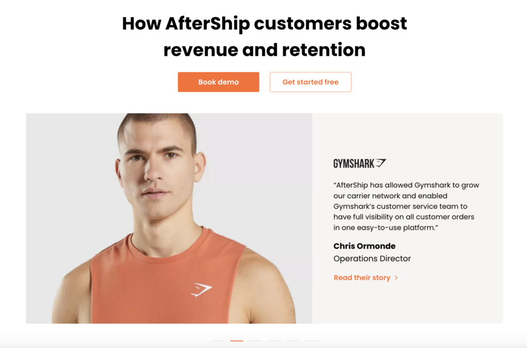
For example, here’s the slide for British fitness apparel brand Gymshark:
And one more for online wine marketplace Vivino:
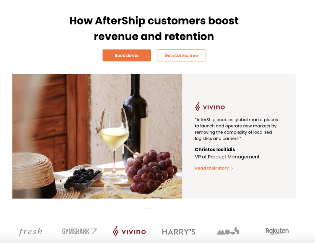
I love the big bright pictures they use to grab our attention—it makes this entire section of their homepage stand out. The logos under the slideshow are clickable, and they give you a sneak peek into their customer stories. It makes it easy for visitors to spot a brand they recognize (or even better, a competitor) and check that story out directly.
The drop-down menu
Aftership doesn’t stop there, though. As you continue navigating their website, you get many more opportunities to check out their case studies.
My favorite is their drop-down menu: not only does it make it really, really easy to find their studies page—it’s right there in Resources, at the top in the Education section—but they even give you an extra sidebar inside the menu with a direct link to one of their studies.
Check it out:
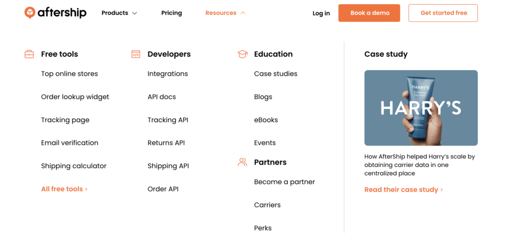
I’ve only seen this featured-study-in-a-drop-down-menu trick used a few times before, and I absolutely love it. It’s impossible to miss but also completely unobtrusive. The image even adds a splash of color to what otherwise would be a text-only menu, which helps the story stand out even more.
And as visitors explore the website, it gives them repeated opportunities to check out a case study and get that sweet social proof that buyers need.
And as visitors explore the website, it gives them repeated opportunities to check out a case study and get that sweet social proof that buyers need.
They’ve even managed to use the drop-down menu to feature more than one study, by switching up what shows up in the sidebar, depending on where you hover your mouse:
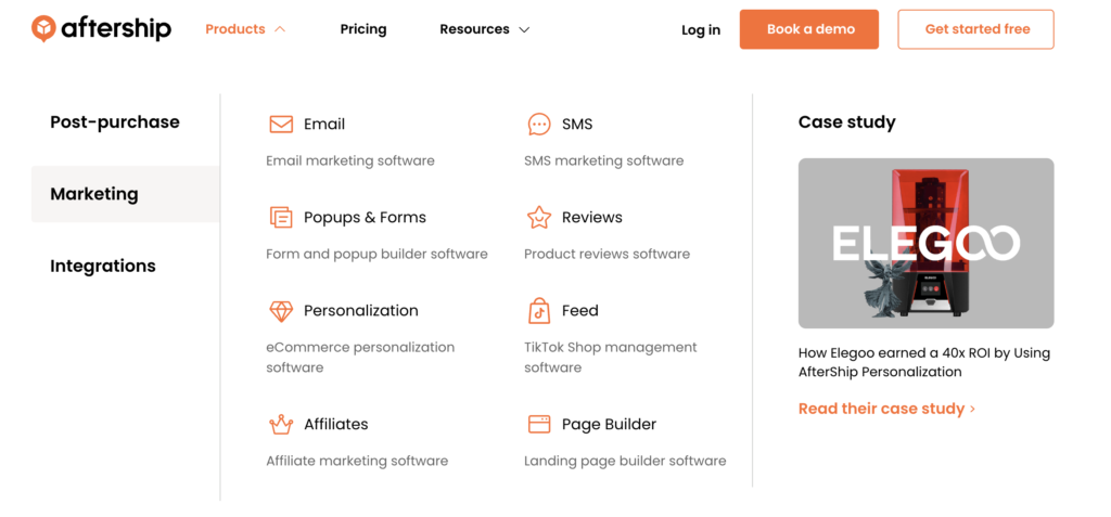
If you look at their tools under Marketing, for example, you’ll see a different case study—one that’s more aligned with the pain points of a lead looking for marketing tools.
The main case studies page
After sprinkling case studies all over their website, their case studies page is where AfterShip brings it all together.
And it doesn’t disappoint.
Let’s start by looking at the different elements:
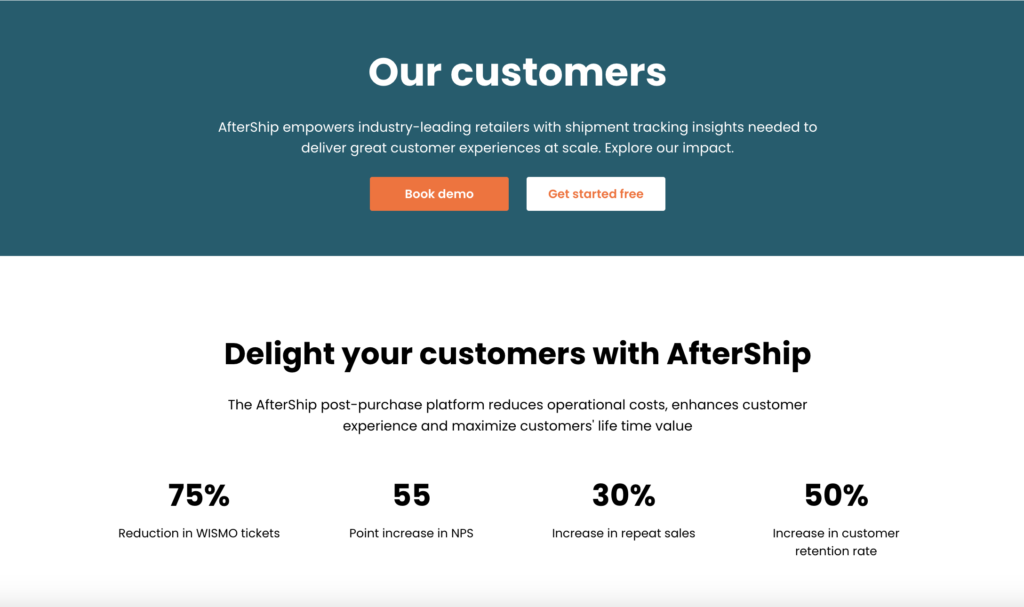
At the top, we get a short blurb about AfterShip, a call-to-action, and a highlight reel of the most impressive results customers have achieved, picked from different studies.
Again, AfterShip positions their industry-leading customers in the best possible light, right from the top.
As you scroll down the page, you get a carousel of featured case studies, similar to what you see on the homepage:
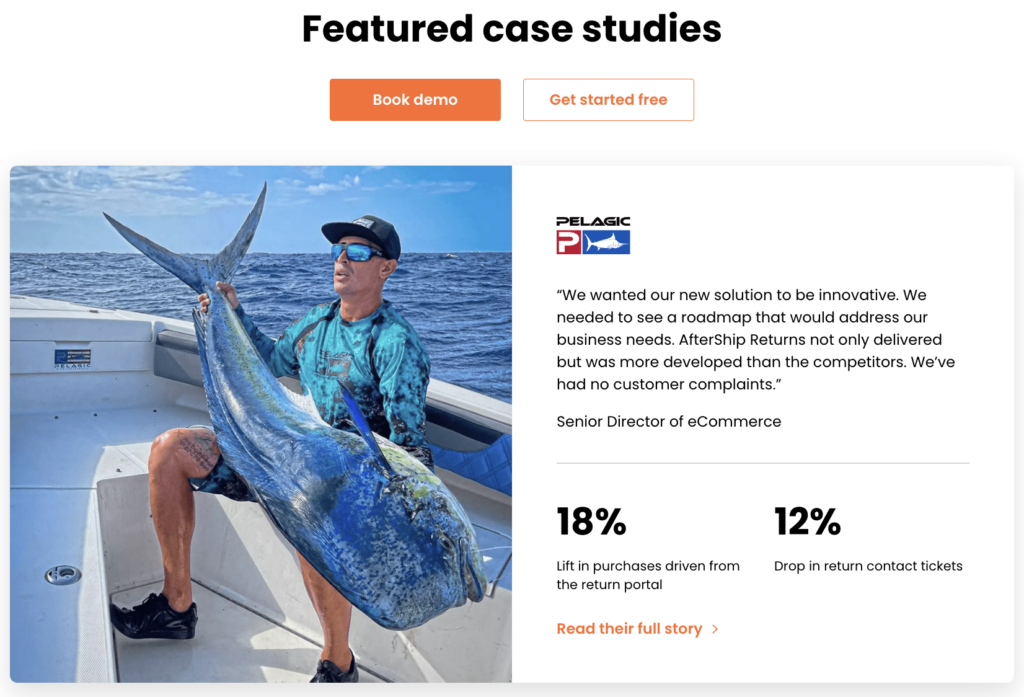
BUT if you look closely, you’ll spot a few key differences.
For starters, this carousel includes a longer blurb for each study, a quick before and after snapshot of what the problem was, and how Aftership helped solve it. This makes sense, since readers on AfterShip’s case study page are presumably more invested in the details than visitors on their homepage would be.
Here, the slide is almost a mini version of the case study, highlighting the most important points. I love the way they made the key result metric bigger than the rest of the copy—your eye is immediately pulled to it.
As you continue to scroll, you can see the rest of their case studies:
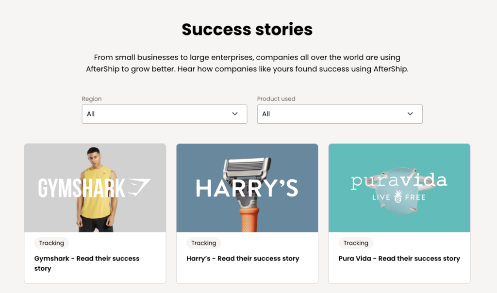
They have a few simple filters in place that allow us to sort studies by location and product used. Filters are important—they make it easy to find the study that’s most relevant for you and your problem, without wasting time—and they can even be an opportunity to get creative.
I would say that AfterShip’s filtering options are a bit simple, though they do cover the basics. That’s probably because AfterShip has only 25 studies featured on their website so far—that’s way below the SaaS industry average of 132. But the way they make full use of the studies they do have by making them easy to find and sharing them widely makes me think that they understand the value of case studies and will continue adding more. And as they continue to build their case study repertoire, they’ll have more opportunities to add more filters, too.
Want more case studies? Find out how the top 1% of companies scale their case study production.
So that’s the story of how AfterShip makes the most of their case studies across their website (we’ll look at the content of those studies too further down).
But of course, the AfterShip website is only a small part of where customers encounter their brand online.
As we’ll see next, AfterShip did a good job of sharing case studies in other places, too.
Social media
One of my favorite things about the way AfterShip shares their case studies on social media is how they adapt their content and format to each platform. It shows that they understand social media, and that they’re not afraid of reformatting and repurposing their content to get the most value from it.
For example, their Instagram page includes this colorful grid made up of customer quotes and logos:
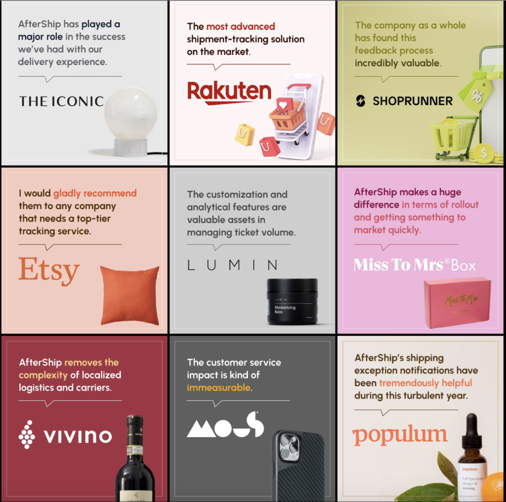
Instagram is the perfect place for pretty, colorful images like these.
If I have to quibble, I think these quotes would have been more powerful with a link to the full case studies in their bio. But even so, the colorful, impactful grid of customer quotes that AfterShip designed works very well for Instagram.
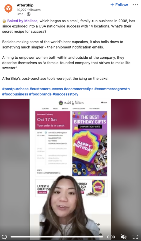
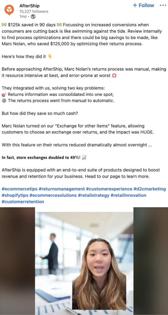
On LinkedIn, AfterShip takes a different tack. They wrote longer posts (the kind of thought leadership-y content that LinkedIn loves) with accompanying videos that walk us through the main beats of the study.
Here’s the one they posted about their customer Baked by Melissa:
And here’s another for men’s footwear brand Marc Nolan:
They use these videos on TikTok too, which gives them access to a different and potentially younger professional audience.
AfterShip used their existing written case studies as the basis for these videos, and their social media manager narrates them. It’s a great way to adapt existing material to a different format and use it to reach a different audience (here at Case Study Buddy, we use a single customer interview to create written studies, videos, and audiograms, for example).
Kudos to AfterShip for maximizing the value of their existing studies with minimal effort and no additional ask to their customers.
Kudos to AfterShip for maximizing the value of their existing studies with minimal effort and no additional ask to their customers.
But if I have to nitpick, I do think that the customer’s voice gets lost in these videos. Since it’s AfterShip’s narrator doing the talking instead of the customer themselves, we lose that direct connection of them telling the story themselves, in their own words.
AfterShip’s videos are made internally, instead of featuring their customers: their marketing manager walks us through the study and explains what happened. Case studies are about putting your customer front and center and letting them speak to others who share a similar problem. For maximum effectiveness, AfterShip could consider interviewing their customers and using those interviews to make video testimonials, with their customers as the hero.
AfterShip shares their stories in some more unusual places, too
Sharing your case studies on social media and across your website is great, but it’s also pretty common. Most companies who take the trouble to invest in case studies share them in at least a few places, though not all of them do it as thoroughly as AfterShip.
But when I was researching, I also found AfterShip case studies in a pretty interesting place: their Bigcommerce partner page.
As an after-purchase solution that integrates with all of the major ecommerce players, it makes sense for AfterShip to integrate with Bigcommerce. By adding their case studies directly onto the page, they get to show existing Bigcommerce customers social proof of why they’re the best solution to combine with their existing tools.
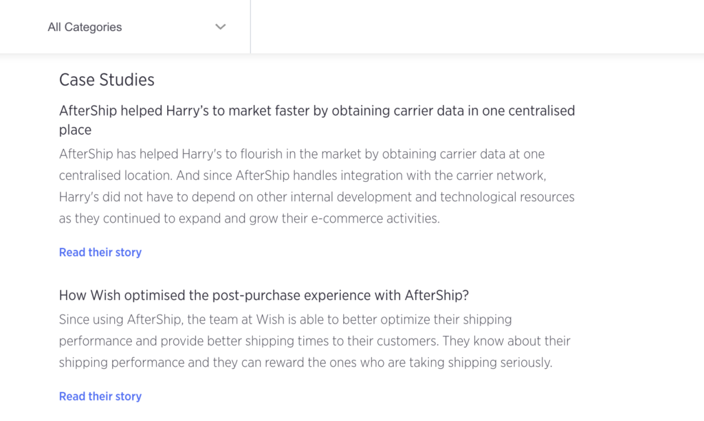
This is an unusual and ingenious use of case studies, and it’s also a good idea.
With a bit of digging, I realized that I can’t give Aftership exclusive credit: several other Bigcommerce partners also have case studies in their descriptions as well. This leads me to believe that Bigcommerce might have a section for “case studies” on a template somewhere that partners fill out.
Still, Aftership gets major kudos for taking advantage of that opportunity—not all partners did.
3. AfterShip grabs readers’ attention
As we’ve seen, AfterShip does a great job of putting their case studies out there where people will find them. That’s because AfterShip is consistently good at grabbing their audience’s attention: it’s a strength that shows up in the way they put their case studies forward, but also in the way they present information, and even the studies themselves.
Let’s take a look.
As we scroll down AfterShip’s homepage, we’re stopped by big, eye-catching, colorful photos for each study in the carousel, as we mentioned earlier. They take up almost the entire screen (at least, they do on my computer)!
AfterShip uses a similar layout on their individual case study pages. You can see a big, bright picture at the top of every one of their stories. I love the colorful cupcakes on their Baked by Melissa story, for example:

But it’s not like AfterShip relies entirely on a pretty picture to make you want to read more, either. They leverage their best metrics right at the top to tell you why this story matters and exactly what this customer was able to accomplish, with their help.
They also use sidebars and pullouts to share some key info about their customer:
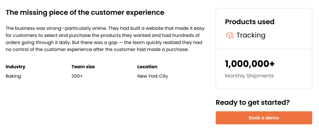
It’s easy to skim this and understand how this customer compares to your own company, with key info like location, industry, and size pulled out.
Having 5,000 case studies on your website won’t matter if they aren’t easily scannable. No one wants to read a huge block of text.
Here’s a screenshot from their Mous study, for example:
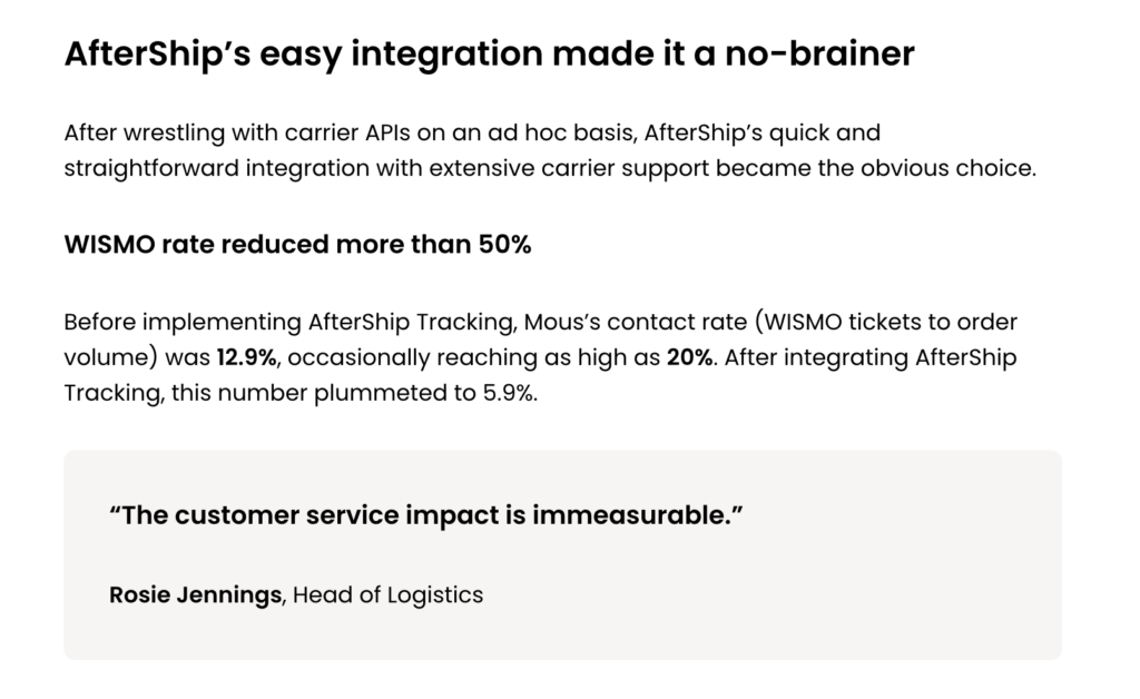
AfterShip’s on-page formatting is always easy to read (or skim) on-screen. They use short paragraphs, lots of bullets, short sentences, and the occasional pull-out quote.
Headlines
Another way that AfterShip grabs our attention (and possibly my favorite): Their delightful punny headlines.
AfterShip is a friendly brand with a sense of humor, and they know how to use that humor to pique our interest. Here’s an example from their study with fishing apparel company Pelagic Gear:

Here are a few more headlines, for shoe brand Marc Nolan:
How Marc Nolan found the right fit with AfterShip Returns
And sports apparel company Gymshark:
How Gymshark made post-purchase gains using accurate carrier data
And electronics accessories company Mous:
How consolidated shipment tracking helped Mous get the cheese
I’m a sucker for corny jokes, and a pun will get me every time—but it’s also important to note that AfterShip isn’t overdoing it with the humor, either.
This is a case study, not a standup set. Making your audience laugh is a nice bonus, but it’s not the primary goal. Striking the balance between fun and friendly is key, and AfterShip does it perfectly.
4. Most importantly, AfterShip lets their customer shine
Case studies are about your customer—they’re the real hero of the story, on an epic quest to solve a thorny problem with your product as a helpful sidekick/fairy godmother/Gandalf-type mage.
Too much? Ok, at the very least, case studies need to center your customer’s story and experience. They need to honor their time and effort.
And that’s exactly what AfterShip does.
At the top of each study, they share a short description of their client’s company and what they do. This is pretty common—many case studies I’ve seen have a small blurb about the company featured before diving into the meat of the story.
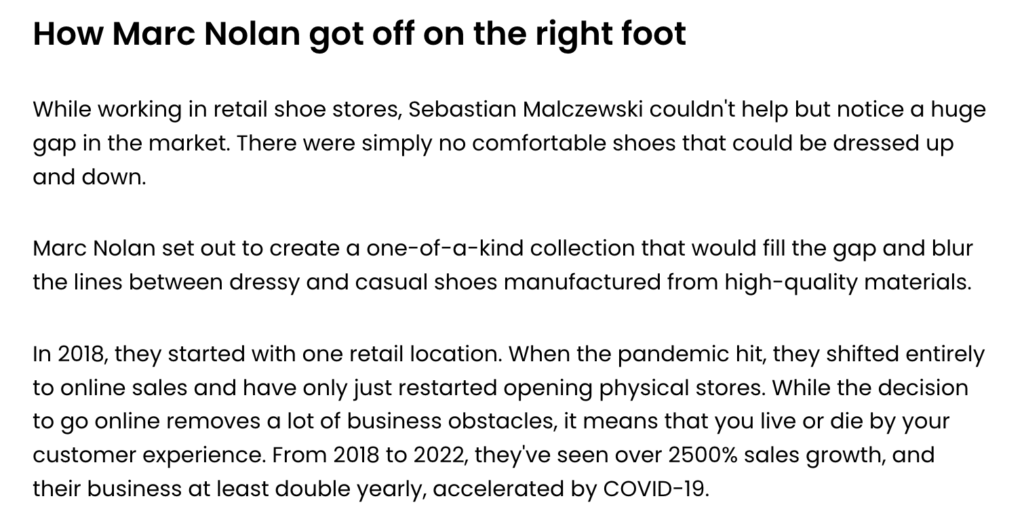
But these blurbs aren’t dry, just-the-facts-ma’am summaries of what their clients do. In a few lines, they tell the stories of each client company’s founding and subsequent growth, tapping into the details that make them unique to personalize their experience. Again, it’s a sign of respect and care for their clients.
Here are a couple examples:
Marc Nolan:
Gymshark:
From humble beginnings in a garage in the UK in 2012, Gymshark has grown to become one of the premier sports clothing brands serving shoppers in over 180 countries, with a social media audience of over 17 million. They’ve been driving this growth with their purpose to unite the entire conditioning community.
These blurbs set the tone for the rest of the study.
When you write about a challenge that a company needs to solve, it’s too easy to make them sound foolish or incompetent, which can really damage relationships with your customers—or cause them to veto the study altogether.
Not so here. In each study, AfterShip continues to position their customer as a smart, capable team of people looking to solve a gnarly problem and find AfterShip, the perfect tool for the job.
Because they do such a great job of making their customers look good, they can tag them when they share their case studies online.
5. AfterShip’s case studies really deliver
After looking at everything AfterShip has done with their case studies, I’m confident in saying that they’ve got the full package (hah). Follow AfterShip’s lead to get the most out of your upcoming and existing case studies, reach new customers, and nurture your existing relationships.
If you’re not sure how, contact us to learn how we can help.